Back in the day, a corporate intranet was a “noticeboard” – somewhere people could share notices, information and events.
For what it was, it worked – a central place everyone could go to get informed.
Nowadays, intranets are expected to deliver everything from comprehensive document storage to workflows, forums and company news.
Technology has brought us a long way – but have we brought users along with it?
Intranets should be the go-to communication tool, but often process and design complexity prevent users from getting what they need.
How do we control access, and impose restrictions and guidelines around content whilst giving users a vibrant place to connect?
The opportunity for an intranet to act as a fantastic collaboration tool is there. We just need to make it accessible, easy-to-use, and intuitive.
Addressing user needs

The priority for designing an engaging and effective intranet is understanding the user base.
For some organizations, this can be vast and varied: from small project groups to large programmes, from global departments to customer service teams.
Good intranet design works for everyone, enabling every employee to feel empowered to participate. This comes from a balance between people, technology and process.
As part of your design process, you’ll need to carry out some essential user base analysis:
Identify your audience. Which different groups will use the intranet? What are their requirements from the system: workflow tool? Document management? Communication hub?
Map user tasks. How can the intranet improve the interactions within and between user groups?
Survey communications needs and desires. What do users need to create and receive: regular news page? Newsletter? Blog?
Three stages to designing a go-to intranet

Your intranet needs to provide appropriate access to every user. It needs to restrict certain content, groups and pages.
Users must feel able to interact with intranet pages without additional training; that the intranet is a familiar extension of the rest of the corporate identity.
They must feel that they have a voice in the midst of all of the content – that their contribution is valuable and straightforward.
There are three elements in achieving all of this with your designers: governance, information and user experience.
Establish Governance
Structure the roles required within the system, and rules to set-up, edit and remove access to different intranet groups and pages.
Test users can help establish the necessary roles and rules to make the system operate smoothly with minimal administration.
Identify user groups based on the organizational and project management structure, as required.
Pro tip: establish a network of Super Users to represent every group. Your intranet design team will want to focus on unlocking development opportunities within the tool. Empower your users to handle access.
Organize and prioritize types of information

Your intranet will require a content management strategy. Users will need to group, categorise and tag content – rendering it searchable, usable, fresh and easy to archive.
Flexible and effective content management will provide powerful search capabilities, easy sharing and effective restrictions.
It should replace email for document sharing, and the issues with storing multiple versions – effectively handling document approval processes.
Pro tip: Run an annual site, page and content Archiving Drive. It will focus the users on keeping content relevant and force a re-think on how they are using their intranet pages and groups.
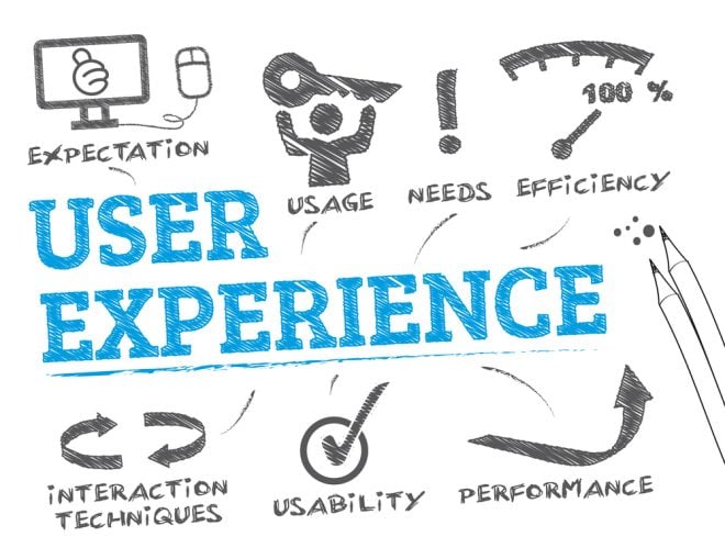
User Experience
Your intranet design should be in line with existing corporate branding and design guidelines.
The design should allow for access on-the-move and provide an intuitive interface.
Your developers will be able to create and customize themes and plugins for the style and features you require.
User experience will be dependent on the following elements of your design strategy:
- Social intranet: the opportunity to author content and make connections with other users
- Mobile functionality: the ability to access consistently on multiple devices
- Intuitive design principles: clear navigation, corporate look and feel
- Engaging collaboration tools: bring teams together in forums, via messaging, sharing documents and by commenting on content
- Positive impact on customer experience: users collaborating effectively and using efficiently designed workflows will present a better front line service offering
- Data analysis: identify what kind of content is used most often (videos, news, employee profiles) and what people are searching for but not finding
Pro tip: Feedback is king. Involve users from the early design phases and employ focus groups even once your intranet is well-established. Let them represent their peers and tell you what they really need.
For your intranet investment to be worthwhile, you’ll need to ensure it is going to be used.
Get the design, structure and strategy right, and you will create a vibrant internal communications channel, enabling everyone in the organization to contribute and collaborate.
Fail to understand the way users will interact with the system, and you won’t get the engagement you need. In fact, users will lose time trying to bend a frustrating process to their requirements – ultimately resorting to inferior alternatives.
Start with the user – then build an intranet that looks, feels and operates like something that will make everything they do at work that bit easier.


 © All rights reserved, BUDDYBOSS LLC 2024


